idearideas
renovando una identidad para dar un salto evolutivo
idearideas es una agencia de creatividad, comunicación y marketing, con sede en castellón y con más de veinte años de trayectoria.
después de años de andadura y de crecimiento, el equipo gerente necesitaba comunicar el punto de consolidación alcanzado y transmitir en qué se habían convertido: una empresa multidisciplinar capaz de ofrecer, desde la honestidad y la exigencia, un amplio rango de servicios y que ha sido capaz evolucionar a la par que sus clientes y de responder a sus necesidades.
idearideas is an agency of creativity, communication and marketing, based in castellón (spain) and with more than twenty years of experience.
after years of professional path and growth, the management team needed to communicate the point of consolidation achieved and to transmit what they had become: a multidisciplinary company capable of offering, from honesty and demand, a wide range of services and which has been able to evolve at the same time as its customers and to respond to their needs.
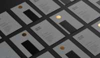

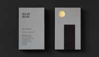
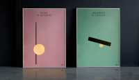
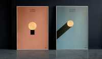
nuestra propuesta pasa por modificar la disposición del anterior logo y potenciar, en dos líneas, el paralelismo del nombre idear ideas. el uso de una fuente condensada y rotunda ayuda a su vez a transmitir la idea de bloque sólido y unido.
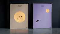
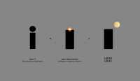
a partir de ahí se crea un sistema flexible que nace de la inicial «i» vinculado de forma subliminal con el monolito de la famosa película 2001: una odisea del espacio, elemento que cada vez que aparece en pantalla significa un momento de cambio y evolución acorde con el momento actual de la firma y la con capacidad de la misma para generarlos. transmite además de forma gráfica el acto de «pensar fuera de la caja», metáfora que significa pensar diferente, de manera no convencional o desde una nueva perspectiva.
our proposal is to modify the layout of the previous logo and enhance, in two lines, the parallelism of the name idearideas. the use of a condensed and resounding font helps in turn to convey the idea of a solid and united block.
from there a flexible system is created, which is born from the initial “i” linked subliminally with the monolith of the famous film 2001: a space odyssey, an element that every time it appears on the screen means a moment of change and evolution according to the current moment of the firm and its own capacity to generate them. it also transmits in a graphic way the act of “thinking outside the box”, a metaphor that means thinking differently, in an unconventional way or from a new perspective.

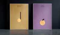
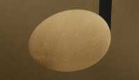
el lanzamiento de la nueva identidad se completa con una campaña donde se hace un homenaje a ilustres “ideadores de ideas” de fama universal. jugando con el símbolo propuesto y aprovechando su flexibilidad gráfica se representan de forma mínima diferentes conceptos como el quijote de cervantes, la manzana de newton o la palanca de arquímedes.
the launching of the new identity is completed with a campaign that pays homage to illustrious “ideators of ideas” of universal fame. playing with the proposed symbol and taking advantage of its graphic flexibility, different concepts such as quixote by cervantes, newton’s apple or the archimedean lever are represented in a minimal way.