subito
la tradición avanza
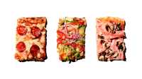
subito es un proyecto de hostelería, en concreto una pizzería takeaway, donde a través del primer establecimiento, ubicado en el barrio de malasaña en madrid, sus propulsores quieren transmitir los sabores italianos auténticos, compartir un producto de calidad y desmitificar el concepto de comida rápida igual a comida de baja calidad.
subito is a project of the hospitality business, specifically a takeaway pizzeria, where through the first establishment, located in the malasaña neighborhood in madrid, its promoters want to transmit the authentic italian flavors, share a quality product and demystify the concept of fast food equal to low quality food.


para nuestra propuesta, el desafío fue alejarnos de las referencias supuestamente artesanas con el objetivo de crear un concepto fuerte y distintivo que no traicionase el compromiso con un producto con una larga tradición y de gran calidad.
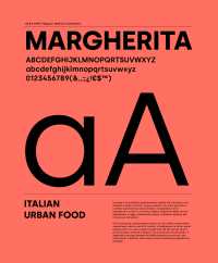
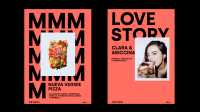
subito (inmediatamente), nombre enérgico y vibrante, con un público joven en mente, reflejo de la naturaleza italiana del negocio y referencia directa al espíritu de un negocio basado en un consumo ágil y a pie de calle nos condujo, como epicentro de la identidad, a crear un imagotipo que surge de la fusión de la imagen sintetizada de dos porciones de pizza y el icono del botón de “avance rápido”. el resultado es sencillo, potente y memorable, y responde a una imagen directa, reconocible y contemporánea.
for our proposal, the challenge was to move away from the supposedly artisan references in order to create a strong and distinctive concept that did not betray the commitment to a product with a long tradition and high quality.
subito (immediately), energetic and vibrant name, with a young audience in mind, a reflection of the italian nature of the business and direct reference to the spirit of a business based on agile and street-side consumption led us, as an epicenter of identity, to create an imagotype that arises from the fusion of the synthesized image of two pizza slices and the “fast forward” button icon. the result is simple, powerful and memorable, and responds to a direct, recognizable and contemporary image.


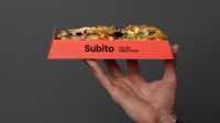
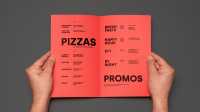
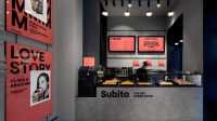
la paleta cromática, basada en un tono coral que envuelve y a su vez se hace protagonista de la identidad, es cálida y atrevida, con una mezcla de juventud y sofisticación. el logotipo, al igual que el resto de la comunicación, está compuesto con silka, una fuente sin serifa neutra que aporta claridad en los mensajes, frescura y un aire contemporáneo. para la dirección de arte en fotografía se buscó un tono casual, inmediato, con sombras duras y con un aspecto casi de fotomatón. el interiorismo planteado y la ambientación gráfica acompañan a la identidad y buscan transmitir un mensaje sencillo y urbano a través de formas limpias y materiales y tonos neutros donde de nuevo el color coral adquiere protagonismo en contraste con las superficies grises.
the color palette, based on a coral tone that surrounds and in turn becomes the protagonist of the identity, is warm and daring, with a mixture of youth and sophistication. the logo, like the rest of the communication, is composed with silka, a neutral sans serif font that brings clarity in the messages, freshness and a contemporary air. for the art direction in photography it was sought a casual, immediate tone, with hard shadows and with an almost photo booth appearance. the interior design and the graphic ambience accompany the identity and seek to convey a simple and urban message through clean forms and materials and neutral tones where again the coral color acquires prominence in contrast to the gray surfaces.