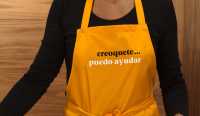
creoquete
una identidad para la reinvención de un plato tradicional
creoquete es una iniciativa culinaria que busca potenciar el lado gourmet de un plato tradicional español como son las croquetas, explorando nuevos sabores de la mano del reconocido chef asturiano alejandro garcía urrutia.
nuestra propuesta empieza por la creación de un nombre que, por un lado, recuerda a «croquette», de origen francés -que viene de croquer, la onomatopeya de «crujir»- y, por otro, sin ser frívolo se muestra lo suficientemente juguetón para crear una serie de mensajes que ayudan, de una manera distendida, a la comunicación de la marca.
creoquete is a culinary initiative that seeks to enhance the gourmet side of a traditional spanish dish such as croquettes, exploring new flavors by the hand of the renowned asturian chef alejandro garcía urrutia.
our proposal begins with the creation of a name that, on the one hand, reminds us of “croquette”, of french origin -which comes from croquer, the onomatopoeia of “crunching” - and, on the other hand, without being frivolous, it is playful enough to create a series of messages that help, in a relaxed way, to the communication of the brand.


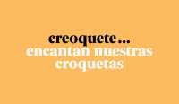
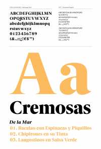
el logotipo está compuesto con la fuente berlingske serif, que elegante y rotunda incorpora una «r» minúscula reconocible y distintiva. siempre va unido a tres puntos, que unas veces hacen de puntos suspensivos que enlazan con un mensaje y otras funcionan como representación gráfica de tres croquetas.
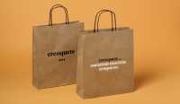
la línea gráfica de la identidad, al igual que las croquetas, la marca el contraste de texturas; el crujiente frente a la cremosa bechamel se traslada a la papelería y el packaging en una combinación de cartones y papeles kraft con papeles estucados blancos.
the logo is composed with the berlingske serif font, that elegant and resounding incorporates a recognizable and distinctive small “r”. it is always linked to three points, that sometimes are an ellipsis that links to a message and sometimes they act as a graphic representation of three croquettes.
the graphic line of identity, like the croquettes, is marked by the contrast of textures; the crunchy versus the creamy bechamel moves to the stationery and packaging in a combination of cartons and kraft papers with white coated papers.


trasladamos el mismo concepto –el contraste de texturas– a la tienda, definida por dos áreas, una recubierta en madera, que envuelve el mostrador y otra, suave y blanca que conecta con el acceso a la tienda. el espacio, diáfano y sin distracciones, conduce al visitante hacia el principal protagonista de la tienda, el producto.
we transfer the same concept –the contrast of textures– to the shop, defined by two areas, one covered in wood, which wraps the counter and another, soft and white that connects with the access to the store. the space, diaphanous and without distractions, leads the visitor to the main protagonist of the store, the product.


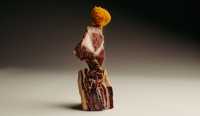
en la dirección de arte huimos de las fotos al uso y apostamos por mostrar los ingredientes de cada croqueta a modo de escultura en perfecto equilibrio. la idea principal era crear una imagen equilibrada acorde con un plato sencillo al que se le ha querido dar un punto de «cocina de autor» pero sin perder por ello la sensación de ser un producto asequible.
in the direction of art we flee from the usual pictures and we bet on showing the ingredients of each croquette as a sculpture in perfect balance. the main idea was to create a balanced image according to a simple dish that has been given a point of “author’s cuisine” but without losing the feeling of being an affordable product.